
An Interview with Jon Redmond
Jon Redmond
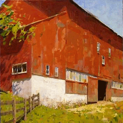
Barn oil on canvas 28"x28" 2009
Jon Redmond chooses subjects for his paintings that are usually close at hand, a humble still life, the local landscape, or the rooms of his home, but always with an eye for the way the right light can transform a familiar scene into one of beauty. As he says, “It is not so much about how beautiful the landscape is to begin with but more how I can find beauty in something that is part of my everyday life.”
You can find out more about Jon Redmond at his website and at the Sommerville-Manning Gallery's website.
You can find out more about Jon Redmond at his website and at the Sommerville-Manning Gallery's website.
TD: You paint a wide range of subject matter that includes still life, landscape, nudes, interiors and architecture. Do you have a favorite at the moment?
JR: I tend to paint whatever I am most interested in exploring at that moment. Sometimes I will paint landscapes for a year and eventually just get tired of working through the same issues so I gravitate towards something that challenges me in a different way. Recently that has been still life because I was having a very hard time painting a landscape that I felt was interesting or successful. The still life has allowed me a bit more control over the subject rather than having to go find a location that fits what you feel you need to express.

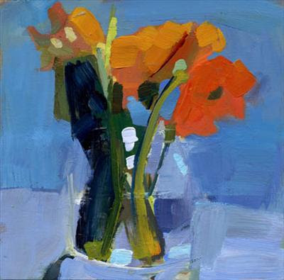
Iris oil on mylar 10"x7" 2011
JR: I don’t want people to expect what I will paint next. One of my big fears as an artist is becoming predictable and boring. My subject is basically the same with all of my paintings. Light is the focus of my work and the “subject” is just a foil for it. I am mostly interested in how we view the world around us and light is what we see, not things, so light is my main focus. If people start asking me to repeat a certain subject that is a signal for me to stop painting that and to move on. I’m not that interested in just giving people what they expect.

Under Barn oil on board 11"x11" 2011
TD: A description for a still life workshop that you teach reads “Bringing energy to a fruitless exercise.” From this statement I might guess that you sometimes find still life less than inspiring. Is this true, and if so, how to you motivate yourself to complete your still lives so beautifully?

Orange on Paper oil on panel 8"x8" 2010
Another still life painter I admire is Georgio Morandi. His paintings however are completely the opposite of Diebenkorn's. Morandi carefully chooses and composes his subjects but the narrative is much less certain. His bottles and boxes no longer are viewed as bottles and boxes but become suggestive of architecture, landscape, human figures or relationships between positive and negative space and subtle shades of grey. Most of my own work tends to focus on just one or two objects, focusing on the play of light across form and space or describing the contrast and similarities between things rather than trying to tell a story. If I am simply searching for my emotional reaction to light then I am pretty happy.

Silver oil on mylar 18"x16" 2012
TD: You have begun a series of nudes that follow the “elegant woman in the bath” tradition that recalls Degas. One of the things I like about these paintings is that these women don’t look as though they were simply posing for a male artist, trying to look fetching; they are supposedly captured in a private, unself-conscious moment. Do you think of Degas while painting them?
JR: Yes of course Degas was a big influence. I was trying to avoid that posed or staged feeling that many nudes have and putting them in the bath gives you a good reason to rid them of their clothes. Degas was so masterful at getting that feeling that you just walked into a room where someone was in the middle of doing something that you were probably not meant to see. Eric Fischl is another who does that well.

Nude in Tub 8"x8" oil on board 2011

Nude Standing in Tub oil on board 12"x12" 2011
TD: You have often painted a wonderful claw-footed bathtub in an very un-modern looking green bathroom. Some other artists have painted beautiful paintings of deteriorating bathrooms, such as Antonio Lopez Garcia and Alex Kanevsky. I wonder, do you still live in the house with that bathtub? When you consider a new place to move to, do you check out the bathroom and the rest of the house for its visual possibilities?
JR: Many of the bathtubs I painted where not in my home but in an old Philadelphia hotel called the Divine Lorrain Hotel. The hotel was being renovated and I was given permission to paint in any of its 100+ rooms. It had not been used in many years so all the hotel had a wonderful deteriorated feel. It was probably one of the most beautiful places I have ever worked. Each room was a different funky color and the play of light through the doors from room to room was just so wonderful. Interestingly, I bought one of the claw foot tubs from that hotel and brought it to my studio to use in the nude series. Alex and I are friends and I told him about the Divine Lorrain, so some of his paintings are of the same building.
JR: Many of the bathtubs I painted where not in my home but in an old Philadelphia hotel called the Divine Lorrain Hotel. The hotel was being renovated and I was given permission to paint in any of its 100+ rooms. It had not been used in many years so all the hotel had a wonderful deteriorated feel. It was probably one of the most beautiful places I have ever worked. Each room was a different funky color and the play of light through the doors from room to room was just so wonderful. Interestingly, I bought one of the claw foot tubs from that hotel and brought it to my studio to use in the nude series. Alex and I are friends and I told him about the Divine Lorrain, so some of his paintings are of the same building.

Hotel Interior oil on board 10"x10" 2009
TD: Where are your favorite places to paint landscapes, and why?
JR: I like to paint places that feel familiar to me so I usually paint very near where I grew up in Chester County Pa. Landscapes are paintings where I want to describe the feeling of light in a space and somehow capture the feeling of that place. It is not so much about how beautiful the landscape is to begin with but more how I can find beauty in something that is part of my everyday life.

WC oil on board 10"x10" 2010

Cut oil on board, 10"x 10" 2006
TD: Were you encouraged artistically as a boy growing up? How old were you when you first knew you wanted to be a painter?
JR: My father is a photographer and my mother loves art so I grew up in the perfect environment for becoming a painter. My brothers and I were always encouraged to be creative and we all now make our living through the arts.

S.P. Whistling oil on board 11"x11" 2011
TD: You’ve studied art in three different schools, getting a BFA from West Chester University, a painting certificate from the Pennsylvania Academy of the Fine Arts, and an MFA from the University of Delaware. Did you begin at West Chester as a painting major? Out of all your teachers from all three schools, can you name the ones who made the deepest impressions on you?
JR: Yes, I knew from elementary school that art was what I wanted to do. The Pennsylvania Academy of the Fine Arts was where I really learned to become a painter. The environment there was great. You were there with hundreds of kids who all had a similar goal and that was to learn a craft that they loved. I had many great teachers starting with my elementary school art teacher Bernice Shapiro who was so much more sophisticated in her teaching methods than many of my college teachers. At the Academy Arthur DeCosta was probably the most influential. He had all of the technical knowledge that I was so eager to learn at that time. There were many great teachers and I am very lucky to have had such a wonderful education.
JR: My father is a photographer and my mother loves art so I grew up in the perfect environment for becoming a painter. My brothers and I were always encouraged to be creative and we all now make our living through the arts.

S.P. Whistling oil on board 11"x11" 2011

Self Portrait with Green Hat oil on panel 10" x 10" 2010
JR: I mostly use just simple hogs hair brushes with the filbert shape. I like the stiff haired brush for its ability to push back through the layer of paint and create a complexity to the painting surface. The blurred edges are more of a result of me not worrying so much about finding my edges. I gradually find the ones I need and lose the ones I don’t.

Warm and Cool oil on board 12"x8" 2005
TD: To get the slightly dry quality to your textures I would guess that you don’t use much medium. Is this true? Do you tone your ground first? Do you begin with a thin paint layer and then build on that with thicker paint?
JR: It is definitely thin to thick. I tell my students to only add as much medium to your mixtures so that the paint behaves exactly the way you want it to. Sometimes I’m using a lot of medium sometimes very little if any at all. So yes, I usually tone my support with a transparent tone and start building areas up from thin to thick with the lightest areas of the painting getting built up the thickest. Some of the textural element comes from the use of Lead White which has a rich heavy feel and lends itself to building up the surface. Also, I think my paintings feel textural because the surface is so diverse with both thin transparencies and thicker opacities.

Hotel Room oil on board11"x11" 2009
TD: I’m interested in knowing more about your approach to capturing reality. The values in your paintings are orchestrated so well. By this I mean you never fall into the trap of painting shadows as dark holes; in fact, in a favorite painting of mine, “Bowlobeans”, you seem to have kept the shadows from getting too dark as a way to keep the beans united against a darker background.

Bowlobeans 8.5" x 8.5" oil on board 2011
How much do change reality depending on what the painting needs, and how much do you base on pure observation?
JR: You have to work around the limitations of paint. Paint can never replicate the wide range of values and colors that we see with our eyes. The key then is to make things feel correct rather than trying to match individual colors and values. Value I feel is much more important than color so trying to get my values to make sense is the most important part of the painting process.

Rose's Julep Cup oil on mylar 18"x18" 2011
Remember, we can understand a black and white photograph which proves that color is not as important as you think it is. Also, I think it is just as important to see where colors and values are similar than it is to see differences. Many painters want to try to make everything different to in an attempt to make things understandable, but it is how things relate in similar ways that unites the space and light in a painting and better captures the way our eyes see.

Barnard Street Triptych oil on mylar 10"x35"
TD: Similarly, your colors are often so rich, leading me to wonder if you ever consciously decide to alter your colors from what you see in front of you.
JR: Again I am not matching anything I see, only trying to get the relationships between everything to “feel” correct. I think my colors feel rich because I describe shadows as rich dark colors not simply darker versions of the local color. Many of the colors from my palette are dark rich transparent colors such as Transparent Oxide Red, Sap Green or Alizarin Crimson, which I can use more purely in shadow areas of the painting and not dilute the intensity by adding something like black to them to deepen their value.

White House 10"x10" oil on board 2011
TD: A review in the New York Times described your work as a “Hopperesque reverie”. Do you find inspiration in Edward Hopper’s work?
JR: I used to look at Hopper quite often. I learned a lot from how he captured light across architecture. But at some point you have to move on and start looking at many different types of artists. The last thing I want is for the viewer to be thinking about another artist while looking at my painting. I want them to be seeing how I view the world. If you cling too closely to another artist’s vision you end up making a cheap copy of their work and lose your ability to find your own way.

Houses with Awnings oil on board 10"x10" 2008
TD: Please name some of your favorite painters.
JR: Besides some of the biggies we mentioned earlier like Degas, Morandi and Hopper, I have been looking at more lesser known contemporary painters such as Giorgio Rorris from Greece, Sangram Majumdar in New York, Diarmuid Kelly in the U.K., Ann Gale from Washington State and Alex Kanevsky here in Philadelphia. All of whom all have a very different and contemporary take on what is essentially an academic eye.

Penobscot Bay #1 10"x10" Oil on panel
JR: Yes I know the Bechler's work and love the straight forward nature of it. Walker Evans is a photographer who thinks in a similar way. I think I use photography differently than I use painting. Photography is more documentarian in its nature. Painting is much more of recording an experience, both the experience of the act of painting, the experience of looking and the experience of your life.

Las Vegas, New Mexico
Untitled
Some of those towns in the Midwest are so beautifully decaying and evocative of a life that is slowly fading into our homogenized suburban sprawlscape. The photographers I like to look at influence me as much as the painters I look at or even the movies I watch or music I listen to. I admire certain artists because the way they capture something that speaks to some indescribable way I feel about my own world. I often wish I could paint a painting that feels the way a pedal steel guitar sounds.
TD: You have exhibited your tintype photography. Can you explain how you became interested in producing tintypes? Are you still producing them?
JR: I stated doing tintypes while at the University of Delaware. They grew out of an Art history class project to write about everyday Architecture. I needed images to go along with a lecture. Pressed for time I ended up re-photographing some contact sheets I had of Black and White negatives. I noticed that there were some beautiful distortions happening while using a macro lens to shoot off of the contact sheet. The re-photographed images were so much more interesting that the originals that I wanted to find a way to use them. Another student was making tintypes and so I brought these strangely distorted images of 21st century housing developments and printed them with this 19th century process. The combination was very beautiful. I stopped doing them because the dry plate process I was using had a lot of archival problems.

Untitled
TD: What do you like to do when taking a break from painting and teaching?
Riding or tinkering on one of my vintage Italian racing bicycles, fixing up my Victorian era home or simply going to a good movie.
Thanks Jon Redmond!


Comments
Post a Comment